
New Kyriale - Proofreaders & Feedback Wanted
-
I have just finished my first complete draft of a newly typeset Kyriale. If anyone has the time and interest to look through it and offer any corrections, suggestions, or feedback, I would be much obliged.
I have attached two copies of it below, one with a blank page first. This is in case the pdf viewers people are using require the document to start with a left page for two page viewing (so the pages can line up like a real book).
This Kyriale is intended for the traditional Latin Mass. I would like to make some bigger chant books eventually too, but that will depend on my state of life, and I figured the Kyriale was a good place to start.Thanked by 1CHGiffen -
I just skimmed it so no serious thoughts, other than the look is quite lovely (I’m not sure about all the line-broken words in the text part).. but I can’t believe I’m seeing dots in chant in 2023. Has Solesmes started using the dots again?
-
As far as the dots go, I actually find it hilarious that you mention that.
I don't know (or really care if I'm being honest) what Solesmes is using these days, but I would assume some up-to-date semiological approach.
The reason I included the rhythmic signs is because I am pretty sure that is what the majority of TLM chanters use. I know there are some outliers, but the general "tradition" for the Latin Mass the last hundred years seems to be what's in the Liber Usualis.
Ultimately I would like to typeset books with the Official Vatican Edition (so leaving out all rhythmic signs). Although I do realize such books would probably be less popular, so I could make editions both with and without the rhythmic signs (if time allowed).
As far as the line-broken words, if enough people don't like it, I can consider alternatives, although to my aesthetic tastes it seems like the best option. -
Well, the newest Solesmes Kyriale is from 2015, though newly engraved, it follows exactly the Kyriale in the 1974 Graduale Romanum, which reused the plates from the 1960 Graduale, so yes, in this instance dots, ictus marks, etc., are still used.
P.S., I haven't looked at the files yet, so I can't comment on them at the moment.Thanked by 1tomjaw -
I think this looks great... Having set a rather larger Kyriale I will note the following,
1. The A of Asperges is too low it covers the top line of the chant below.
2. The drop caps do not appear to have a constant distance around them
3. The different font sizes in the Ordinary look odd. (but it does look odd in various Hand Missals I have.
4. The line length of the chant is a little too long. The Solesmes books have 3 different settings of the chant. Gradaule, L.U., and a smaller size. Your line length is longer than all of them.
I chose to use GR text and stave size with a slightly longer line, and a taller page, to get in an extra line of chant. Of course this all depends on the size of paper!Thanked by 1OMagnumMysterium -
I'm sending a copy of the PDF with some notes to your e-mail address.
Thanked by 1OMagnumMysterium -
@tomjaw
Thanks for the feedback.
1. I will try to fix that, thanks for noticing.
2. If you're talking about the drop caps in the Requiem section, I'm trying to fix those, but can't seem to figure out how. If you're talking about something else, let me know, I still haven't noticed any other unevenness even after checking again.
3. I get your point. I like how it all fits so nicely on just a few pages that way, but if people are bothered enough by the inconsistency, I suppose I could try to change it. It would be a pain though...
4. The size is actually very intentional. It is made to be 8.5x5.5 (which would be Liber sized chant) or 9x6 (which would be Graduale sized, and my personal preference). The idea behind this is to avoid books with brick-like proportions. Even if a book does have to be thick, at least it should have proportionately big pages, and printing large enough to be easily read. In hindsight, the 9x6 size would be the same trim size and chant size as the Parish Book of Chant.Thanked by 1tomjaw -
I think this all looks quite beautiful. The one thing that bothers me, in particular, is the irregular hyphenation. This is one of my main gripes with the GABC engine; we have little-to-no control over when/where it decides to add hyphens. (notably, you can add them to taste, but you cannot suppress them, so far as I'm aware) My own practice is to include them, and include them everywhere. Experienced chanters don't need them, but noobs do, and they can be particularly helpful for people who are not comfortable with Latin, helping them sound things out syllabically.
The problem in your document is that sometimes there are hyphens between all syllables, and sometimes there aren't, and then even adjacent chants have different hyphenation. Take page 22 for example:
Asperges me, Do-mine, hyssop-po, et munda-bor: la-va-bis me...
As-perges me, Domine, hysso-po, et mundabor: la-va-bis me...
Asperges me, Domi-ne, issopo, et munda-bor: la-va-bis me...
It needs to be an all or nothing, and certainly each repeated text needs to agree. At a minimum, I would add hyphens wherever pitch or neume grouping changes.
As-per-ges me, Do-mi-ne, hys-so-po, et mun-da-bor: la-va-bis me...
All of those niggles aside, what you've assembled is quite beautiful, and very well-done on the whole. You have a nack for creating beautiful books. -
Nice booklet!
Another minor remark: ae is treated as æ until p.93, then as two separate letters (except the verses on p.109 and 112, where it is æ again).
The hyphenation looks more or less OK to me according tradition: syllables placed with their vowel under the first note of a neum (this is not always really precise, though) and when two neums approach too closely, you get a hyphen.
Different melodies = different neum widths = different hyphenation of the same text.
Thanked by 1OMagnumMysterium -
The notion that hyphens are an "all or nothing" proposition strikes me too as peculiar. One place where one might want to force them is when singing in a pronunciation that distinguishes between vowels in open and closed positions, for example Mozart's "Di-xit", "ju-stus", or my favorite, "de-xstris".
-
While I've got my favorites too, I prefer to stick to traditional conventions. Preferences in Latin hyphenation may depend on your mother tongue... well, so does the old convention to write 'j' instead of 'i' to distinguish between diphtongue and double vowel.Thanked by 1OMagnumMysterium
-
I happened to spot an 'eius' instead of (everywhere else) 'ejus': p.15 right column 8th row.
Its really hard to find any typos!Thanked by 1OMagnumMysterium -
The notion that hyphens are an "all or nothing" proposition strikes me too as peculiar.
As stated, this is really to help people who need the help, and it also regularizes the edition so that everything presents the same.
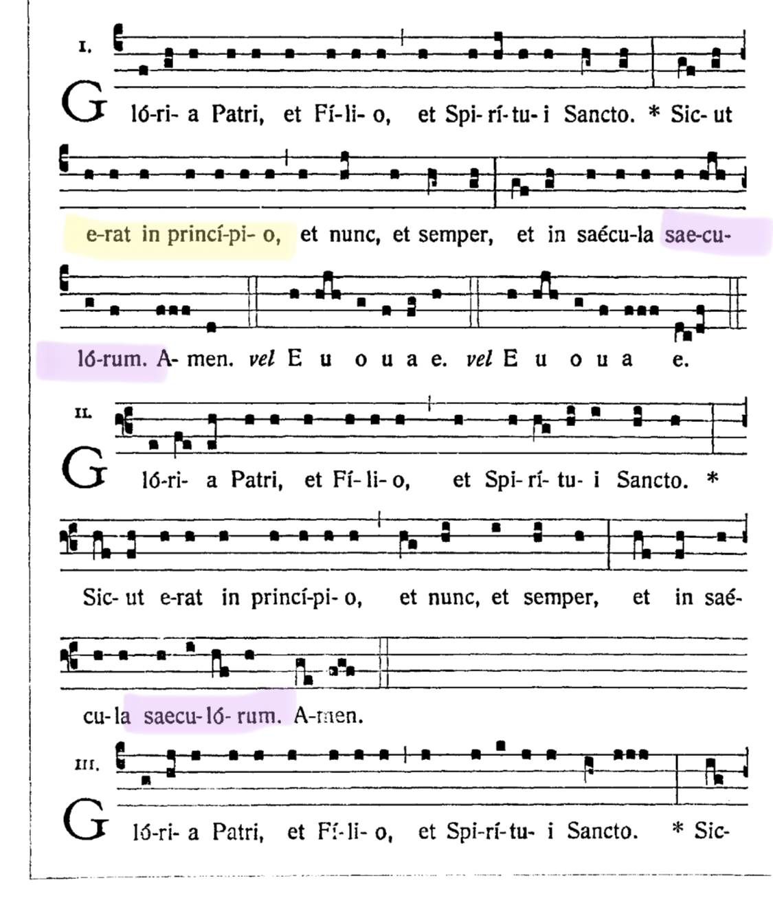
The other reason is my OCD. I find it maddening when you have a word with three syllables, all on the same reciting pitch--but each with their own notes--and only one of the syllables is hyphenated and the others aren't. It's completely arbitrary and looks terrible. "Magnifi-cat" all on the same note makes no sense. Hence, I add the missing ones so the word looks and reads evenly. As an example in this case: page 18 of the first PDF: Glo-ri-a patri et fi-li-o. Patri has no hyphenation while fi-li-o is completely hyphenated. It is arbitrary and looks weird. (Again, this is a GABC engine issue.)Thanked by 1OMagnumMysterium -
Yes Francis: De-xtris is, as you might guess, on page one.
-
In general, lovely. Where did the large drop-cap illuminated letters come from? Is there a place to download or purchase that font?
-
The big one on the Asperges is Goudy Initialen, and the rest of them are all Zallman Caps. I found all my fonts by looking through the LaTeX Font Catalogue.
https://tug.org/FontCatalogue/otherfonts.html#initials
I put together the book in LaTeX, and I believe all of these fonts are already contained in LaTeX. I just tell the program to use the package.
I really like the Zallman Caps, and the blackletter font too. I wouldn't mind replacing the one on the Asperges though if I could find one I like better.Thanked by 1frlukewetzel -
No, it's traditional typesetting of Gregorian Chant - or else hyphenation in the Solesmes edtions is 'arbitrary' and 'weird' as well:"Magnifi-cat" all on the same note makes no sense. Hence, I add the missing ones so the word looks and reads evenly. As an example in this case: page 18 of the first PDF: Glo-ri-a patri et fi-li-o. Patri has no hyphenation while fi-li-o is completely hyphenated. It is arbitrary and looks weird. (Again, this is a GABC engine issue.) -
Btw. This exact hyphenation...
Glo-ri-a patri et fi-li-o. Patri has no hyphenation while fi-li-o is completely hyphenated.
... is already applied in the Vatican edtion (1908) of the Graduale Romanum, see attached file.It is arbitrary and looks weird. (Again, this is a GABC engine issue.) -
Random.
Just because it was poorly conceived a century ago doesn’t mean those choices should be arbitrarily followed today. 1125 x 1320 - 503K
 -
It's not random. Hyphens are only added when notes/neums would not otherwise align with the vowel in a syllable (allowing for minimum spacing between notes/neums). The "tr" in "Patri," and the "nct" in "Sancto." provide enough space for the notes to align over the "a" & "i" in "Patri," and the "a" and "o" in "Sancto." Ditto for the "nc" in "princi-pi-o," and the "mp" in "semper," ... It's a spacing issue and the algorithm is to eschew hyphens when notes align over the vowels in syllables without them.
-
Indeed, what Charles says. The notes are preferably spaced out as evenly as possible and the syllables are placed beneath them accordingly; sometimes a hyphen is needed to gap the white space between syllables (with the hyphen placed directly after the syllable and not in the middle between two syllables). So, generally, the spacing of notes takes precedence over that of syllables. This was, of course, only conceived when the new way of printing Gregorian Chant was developed at the end of the nineteenth century.
-
I would buy it if the notes actually were centered, and if the same word wasn’t hyphenated differently in multiple instances within the same edition (on the same page, no less).
-
Hyphens as needed to align with notes is an almost immemorial convention of music, rather than a 19c novelty. Even in Petrucci's prints one sees "Kyrie eley-son ky-rie e - ley- son." To go earlier, have a peek at Modena B, where multiple hymn verses are carefully aligned syllable by syllable beneath the gregorian neums.
-
The main section of my Kyriale has been published here by some Friends in Germany / Switzerland.
-
@chonak
We have printed 300 as a trial. We are more than happy with the quality and the price c. $2 a copy.
My proofreaders have noticed a few problems, but we welcome comments and extra proofreaders. Only the main section has been printed as part of this trial, and not the two supplements.


Welcome to the MusicaSacra Forum!
To participate in the discussions on Catholic church music, sign in or register as a forum member, The forum is a project of the Church Music Association of America.
Categories
- All Discussions21,132
- General Music Discussion7,607
- Job Openings1,310
- Management of Music Programs833
- Choral Matters519
- Church Documents and Rubrics504
- CMAA Notes291
- Events651
- For Newcomers: Read First23
- Sacred Polyphony529
- Hymnody821
- Gregorian Chant: General2,583
- ↳ Graduale Romanum and Liber Usualis354
- ↳ Graduale Simplex55
- ↳ Semiology57
- Vernacular Plainsong672
- Anglican Use and Anglican Chant66
- Organ, Other Instruments and Repertoire414
- New Composition/Works in Progress1,208
- Recordings222
- Music for Hispanic Ministry151
- Music Education: Children205
- Music Education: General214
- News Items242
- Positions Wanted58
- General Discussion: Catholicism723
- Amusements171
- General Discussion1,002
- Opinions113